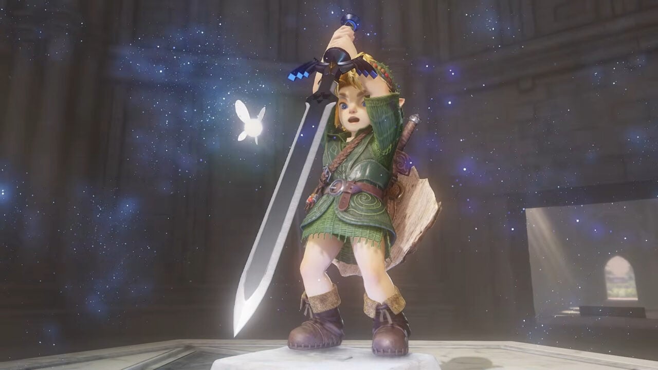
The latest reveal of the Ocarina of Time remake has ignited a fierce debate over Link's hyper-realistic design, which critics claim clashes jarringly with the rest of the game's art style.
- Link's new design is criticized for falling into the 'Uncanny Valley' due to hyper-realism.
- A stark visual contrast exists between the protagonist and the more stylized supporting characters.
- The design shift signals a possible move by Nintendo toward competing with AAA photorealistic titles.
The gaming community is currently embroiled in a heated debate following the Legend of Zelda 40th Anniversary Direct. While anticipation for the Ocarina of Time remake was sky-high, the latest extended look has left many fans and critics unsettled. The primary point of contention is the visual representation of Link, who appears to possess a level of detail that feels disconnected from the world he inhabits.
Critics describe Link's appearance as "plasticky" and overly slick, particularly when interacting with environmental effects like water. This hyper-realistic approach has led to accusations that the character looks like a product of generative AI or a high-end Unreal Engine 5 fan project, rather than a cohesive Nintendo creation. The result is a classic case of the "Uncanny Valley," where a figure looks almost human but not quite, triggering a sense of unease in the viewer.
Interestingly, this visual dissonance is limited almost exclusively to the protagonist. Supporting characters, such as Princess Ruto and the Great Fairy, as well as the various monsters of Hyrule, have been praised for their updated yet stylized looks. This creates a surreal experience where Link feels like he has been "isekai'd"—transported from a photorealistic dimension into a world that remains comfortably cartoonish.
Why This Matters
BozokMedia analysis shows that this is not merely a matter of taste, but a fundamental shift in Nintendo's design philosophy. Historically, Nintendo has avoided the "realism trap," opting for timeless art styles (like the cel-shading in Wind Waker) that age gracefully. By attempting to compete aesthetically with titles like GTA VI or Wolverines, Nintendo risks creating a game that looks dated much faster than its predecessors.
The pursuit of photorealism often strips a character of their iconic essence, replacing artistic identity with technical vanity.
This is not the first time the Zelda franchise has faced a graphical identity crisis. The transition to the stylized look of Wind Waker and the grittier tones of Twilight Princess both sparked massive community backlash at launch, only to be hailed as masterpieces years later. However, the current divide between the protagonist and the environment in the Ocarina remake is a new and more jarring technical challenge.
The original 1998 release on the Nintendo 64 was defined by its polygonal constraints, which ironically created a cohesive and iconic aesthetic. By moving toward hyper-realism, Nintendo is stepping away from the creative autonomy that has defined the brand for four decades, attempting to fit into a modern AAA mold that may not suit the whimsical nature of Hyrule.
| Era | Art Style | Community Reception |
|---|---|---|
| N64 Original | Low-Poly/Stylized | Iconic/Revolutionary |
| Wind Waker | Cel-shaded/Cartoon | Initially Polarizing, now Beloved |
| OoT Remake | Hyper-Realistic (Link) | Highly Controversial/Jarring |
Frequently Asked Questions
Q: Is the Ocarina of Time remake using Unreal Engine 5?
A: While it looks like it to some critics, it is developed by Nintendo's internal teams, though it aims for a similar level of high-fidelity realism.
Q: Why does Link look different from other characters?
A: It appears there is a discrepancy in the level of detail applied to the protagonist compared to the NPCs and enemies, leading to a visual clash.