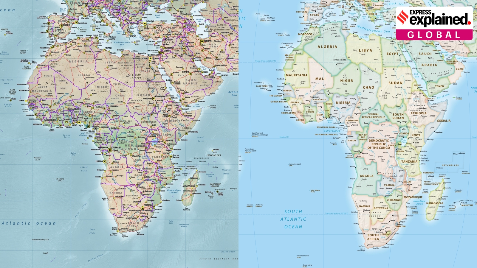
The United Nations has moved to phase out the colonial-era Mercator map in favor of the 'Equal Earth' design. This historic shift aims to rectify geographical distortions and provide a more equitable representation of the world's continents.
- The UN General Assembly voted to phase out the 16th-century Mercator projection.
- 164 nations, including India, supported the 2018 Equal Earth design.
- The Mercator map significantly distorts the size of continents near the poles.
- The shift aims to 'decolonise' global education and correct historical biases.
In a landmark move at the United Nations General Assembly, 164 member states—including India—voted to adopt a resolution to formally phase out the centuries-old Mercator projection. In its place, the UN has embraced the 2018 'Equal Earth' map design, a move intended to provide a more accurate depiction of the world's landmasses, particularly the continent of Africa.
While the United States voted against the resolution and six other nations abstained, the implications of this vote are profound. Although UN resolutions are not legally binding, this decision is expected to trigger a massive shift in global educational curricula, textbook publishing, and digital mapping technologies used worldwide.
Historical Background: A Tool for Sailors
The Mercator projection was created in 1569 by the mathematician and engraver Gerardus Mercator. At its inception, it was not intended to show relative sizes, but to serve as a vital navigation tool for sailors. By projecting the Earth onto a cylinder, Mercator created a map where a straight line between two points represented a constant compass bearing. This revolutionized maritime travel and made it the gold standard for navigation for over four centuries.
The Problem of Distortion and Colonial Bias
The fundamental flaw of the Mercator map lies in its geometry. To flatten a sphere onto a rectangle, the map must stretch the areas near the poles. This results in massive distortions: northern regions like Russia, Canada, Greenland, and Europe appear much larger than they actually are. Conversely, continents near the equator, such as Africa and India, appear significantly smaller. For instance, on a Mercator map, Greenland looks comparable to Africa, whereas in reality, Africa is approximately 14 times larger.
Why This Matters
BozokMedia analysis shows that this is not merely a mathematical error, but a socio-political issue. Critics argue that the Mercator projection served as a tool of Western cultural hegemony. By making the Global North appear dominant and massive, while shrinking the Global South, the map inadvertently supported the colonial narrative that African and tropical territories were less significant or 'conquerable.'
The Mercator projection was more than a map; it was a political instrument that contributed to the psychological diminishment of the Global South.
The transition to the 'Equal Earth' map, developed by an international team of cartographers, is seen as an act of 'decolonising' the world's view. Supporters, including the African Union, argue that this change will help reclaim Africa's rightful place on the global stage by presenting its true scale to students and citizens worldwide.
| Feature | Mercator Projection | Equal Earth Map |
|---|---|---|
| Primary Use Case | Maritime Navigation | Equal-area Representation |
| Size Accuracy | Low (High polar distortion) | High (Maintains area ratios) |
| Global Perspective | Eurocentric/Northern focus | Balanced/Global focus |
Frequently Asked Questions
1. Is the new UN map mandatory for all countries?
No, UN resolutions are non-binding, but they set a global standard that will likely influence education and technology sectors.
2. Why does Greenland look so big on old maps?
Because the Mercator projection stretches the latitudes as they move away from the equator toward the poles to maintain straight-line navigation paths.