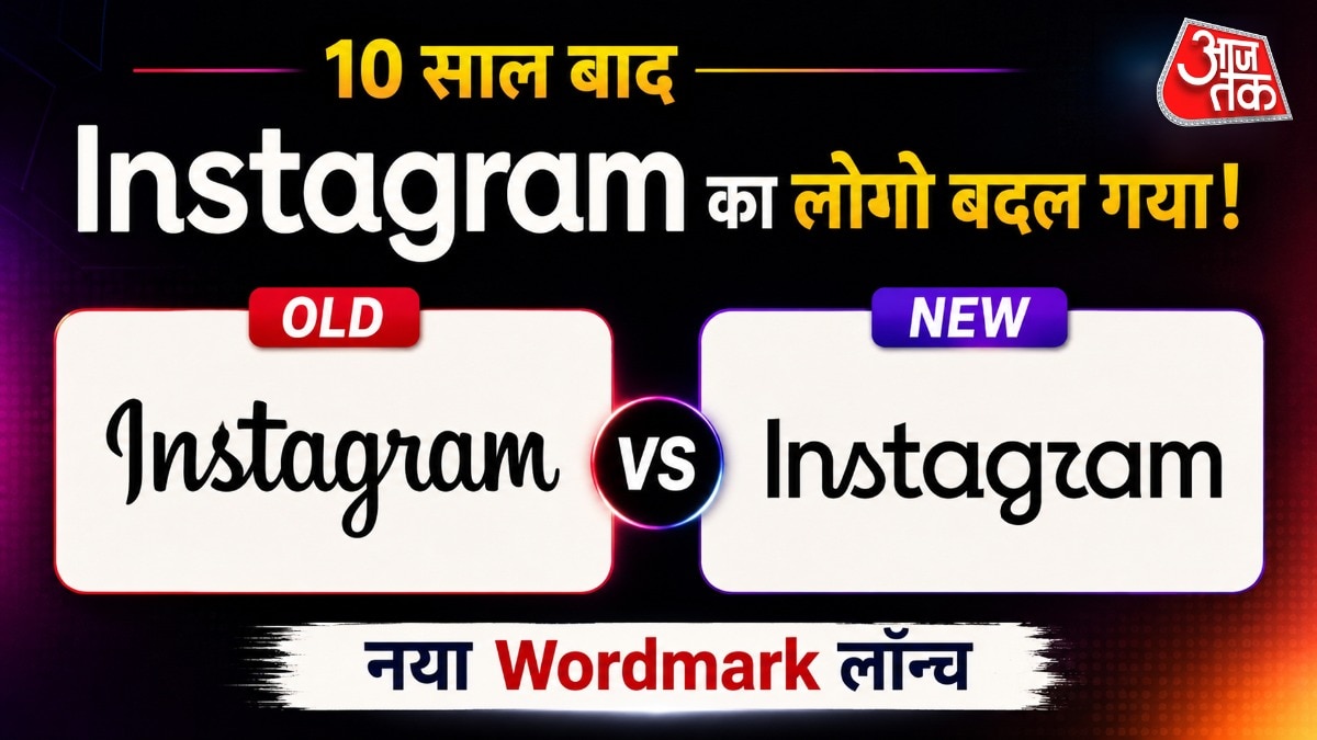
Instagram has refreshed its iconic wordmark logo after a decade, moving towards a cleaner, modern aesthetic that has divided the internet.
Key Takeaways
- Instagram has redesigned its signature wordmark after a 10-year hiatus.
- The update focuses on a cleaner, modern font rather than changing the main app icon.
- Users on Reddit and X have reacted mixedly, with some mocking the design as 'Instagzam'.
Social media giant Instagram has officially refreshed its identity by redesigning its wordmark logo after nearly a decade. The move aims to provide a cleaner, more modern aesthetic that aligns with current design trends. However, the rollout has met with significant pushback from long-time users who feel the brand's essence is being lost.
What has changed in the logo?
For the past ten years, the Instagram wordmark was characterized by its distinct cursive, handwritten style. The new design attempts to bridge the gap between that classic cursive feel and a more structured, modern print font. Adam Mosseri, Head of Instagram, noted that the wordmark had not been updated in a decade and required a refresh to stay relevant in a changing digital landscape.
Why This Matters
BozokMedia analysis shows that brand evolution is a delicate balancing act between modernization and nostalgia. When a platform as massive as Instagram alters its visual DNA, it risks alienating users who have built a subconscious connection with the previous aesthetic. This redesign is a strategic attempt to signal a new era for the platform.
Changing a decade-old visual identity is a high-stakes gamble that tests the limits of brand loyalty and user perception.
The internet's reaction has been swift and largely critical. On platforms like Reddit, users have begun trolling the new font, with many jokingly referring to the brand as 'Instagzam' due to the perceived awkwardness of the new letterforms. The debate highlights the difficulty of maintaining brand recognition while pursuing a 'cleaner' look.
Historical Background
Instagram's last major visual overhaul occurred in 2016, when the platform transitioned from its classic skeuomorphic camera icon to the colorful, minimalist gradient icon used today. While that change was also met with initial skepticism, it eventually became one of the most recognizable symbols in the tech world.
Frequently Asked Questions
1. Has the Instagram app icon changed?
No, only the text-based wordmark (the name 'Instagram') has been redesigned. The main camera icon remains the same.
2. Why are people calling it 'Instagzam'?
Users find the new font style somewhat unusual, leading to memes and nicknames that mock the new lettering.